14 Shelf Wallpaper Ideas That Make Built-Ins Look Seriously Custom
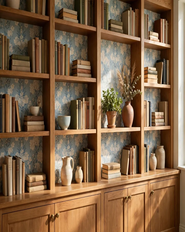
The fastest way to make built-in shelves look custom is not new shelving — it is wallpaper on the back panel. A patterned backing adds depth, frames everything you display, and turns a plain bookcase wall into a finished feature, usually in a single afternoon. Peel-and-stick wallpaper makes the project renter-friendly too, since it comes down without damaging the furniture underneath. Below are 14 shelf wallpaper ideas that actually work in real rooms, plus how to pick a pattern that flatters your shelves instead of fighting them.
How to Pick Wallpaper for Shelf Backs
Three decisions matter more than the exact print. First, match the pattern scale to the room: small repeats suit tight spaces and short viewing distances, while large motifs need a big wall and several feet of distance to read properly. Second, let the shelf color set the contrast — dark shelving needs a lighter or warmer backing to avoid a heavy black hole effect, and white shelving needs enough contrast to stop it disappearing into a pale wall. Third, remember that books already supply plenty of pattern, so the busier your shelves, the quieter your wallpaper should be. If you are also dealing with a dim room, these ideas for how to brighten a dark room pair well with a light-toned shelf backing.
1. Soft Botanical Print Behind White Shelves
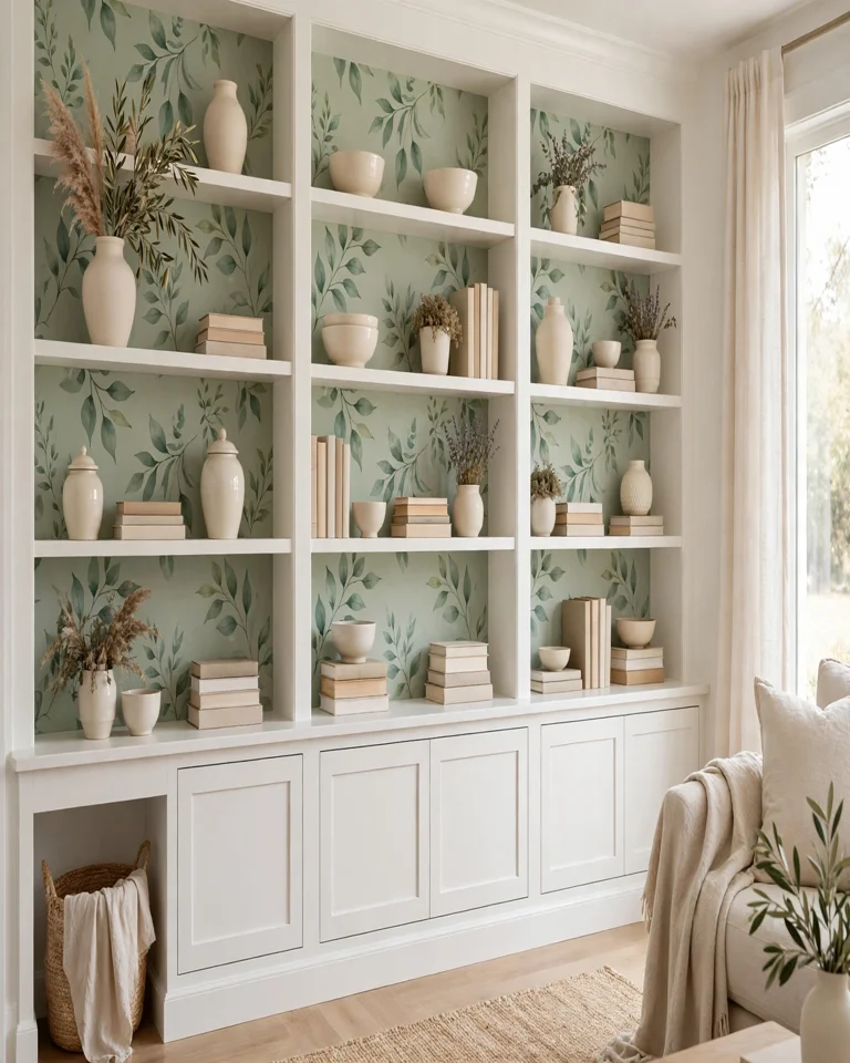
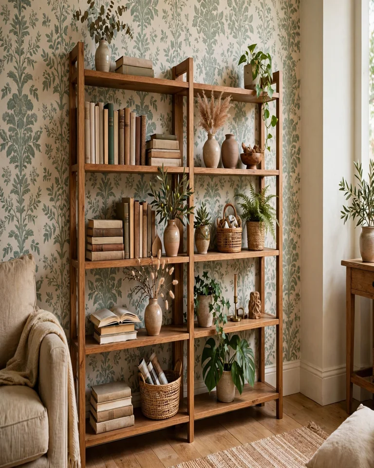
A gentle leaf or vine print in sage, cream, and soft green keeps white shelving from looking flat while staying calm enough for everyday living rooms. The botanical shapes add movement without shouting, which is exactly what a display of books, ceramics, and framed photos needs behind it. Tip: repeat one green from the print in a plant or a vase on the shelves so the whole wall reads as one deliberate scheme.
2. Moody Charcoal Floral for a Library Wall
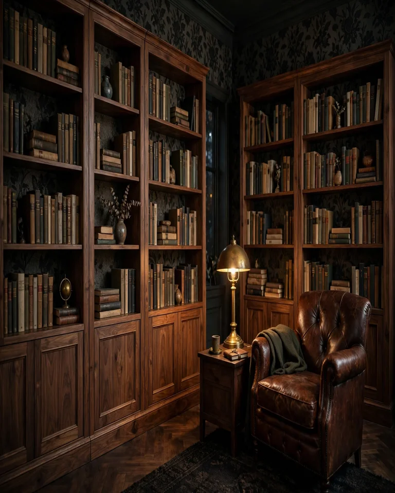
Dark floral wallpaper gives tall bookcases a rich, library-like depth, especially when the shelves themselves are walnut or another warm wood. The deep background makes lighter objects — cream book spines, brass, pale ceramics — stand out beautifully. Tip: add a warm lamp or two; moody backings need a little light or the lower shelves can go gloomy.
3. Warm Grasscloth Texture Behind Black Built-Ins
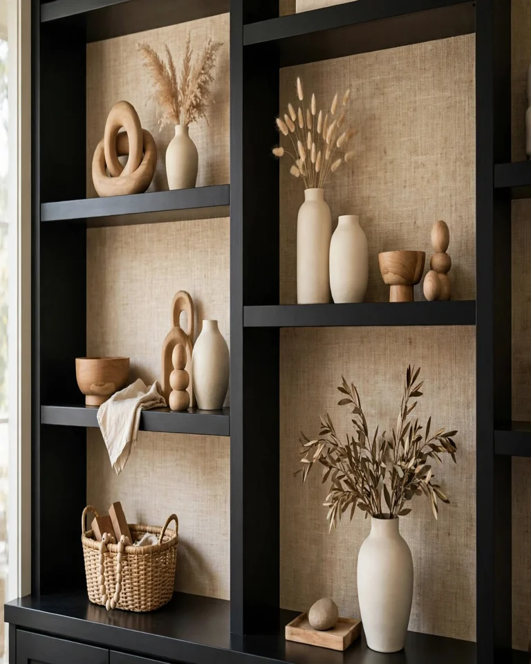
Matte black shelving can look severe, but a warm beige grasscloth-effect backing softens it without adding a competing pattern. The woven texture catches light differently through the day, so the recesses gain interest as the room’s light changes. Tip: keep accessories in warm neutrals and wood tones — bright white pieces create harsh contrast against black frames.
4. Bold Geometric Print in a Modern Living Room
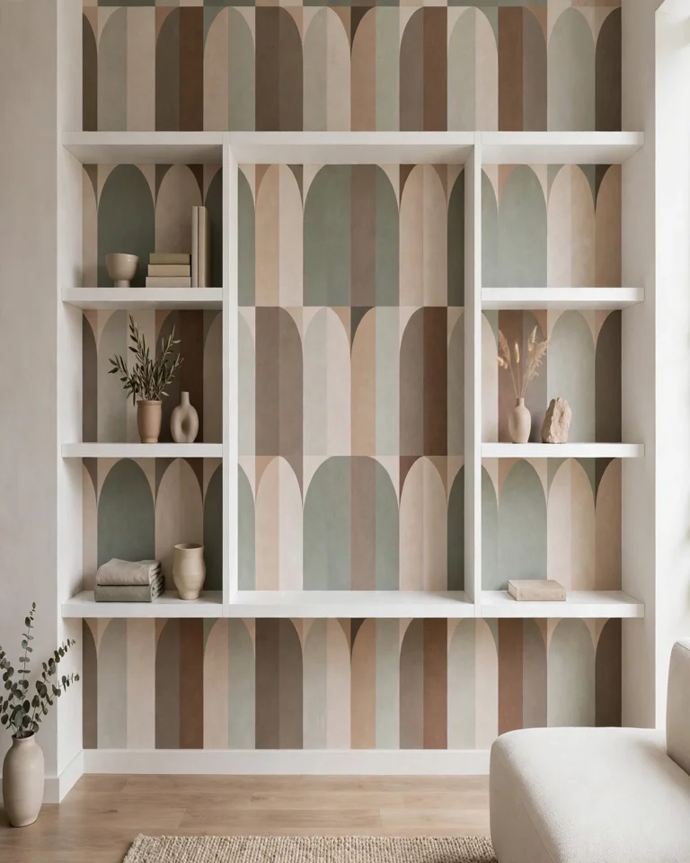
Arches, grids, or abstract shapes in two or three tones give plain modern shelving an architectural feel, almost like the wall itself was designed around the shelves. Because the pattern carries so much energy, the styling on the shelves should stay simple and edited. Tip: limit yourself to one accent color pulled from the print for everything displayed, and leave at least one shelf section partly empty.
5. Chinoiserie in a Pale Blue Built-In
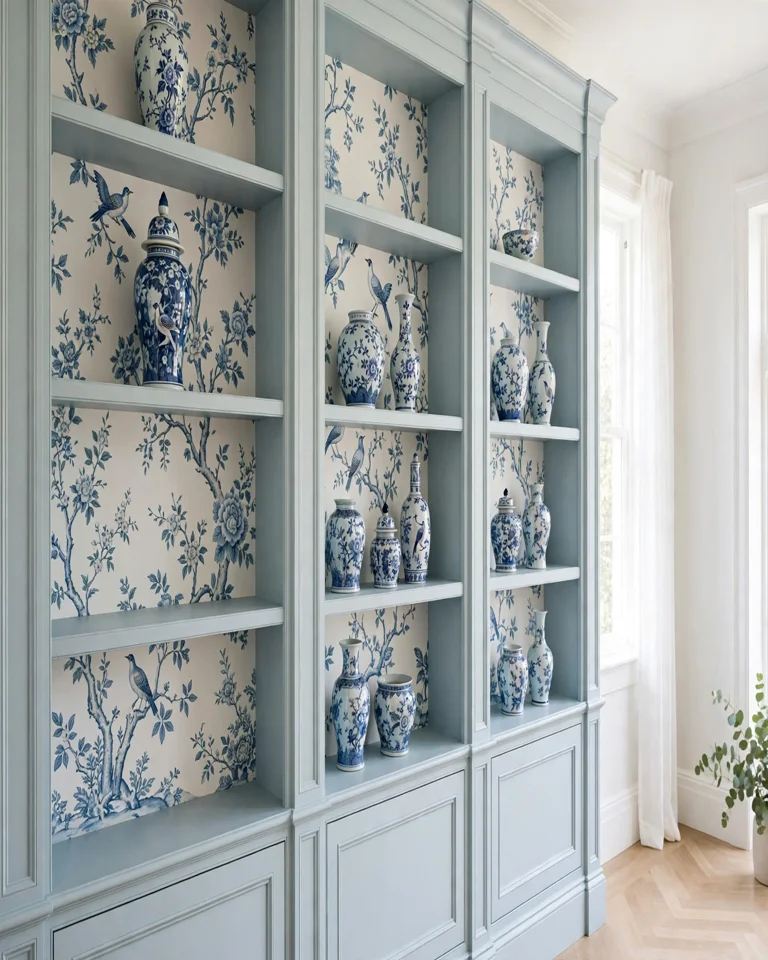
Delicate chinoiserie — birds, branches, and blossoms in blue and white — turns painted built-ins into something that feels collected and traditional rather than merely functional. The fine detail rewards close viewing, which suits living rooms and dining rooms where people actually sit near the shelves. Tip: echo the palette with blue-and-white ceramics, but don’t try to match the print exactly; near-matches look more curated than perfect ones.
6. Vintage Map Wallpaper in a Home Library
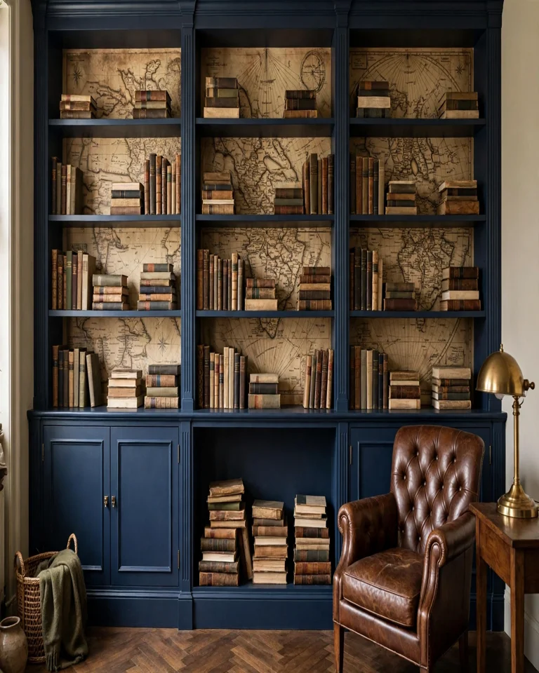
Old map prints bring an instant story to a library or study wall, and they make sense in a room already full of books. The sepia and ink tones sit comfortably against navy or deep green cabinetry, and the fine linework reads as texture from a distance. Tip: keep the desk and chair below simple — the wallpaper is already the room’s conversation piece.
7. Tiny Botanical Print in a Small Powder Room
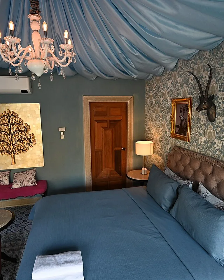
Small rooms punish big patterns, so a tiny botanical repeat is the right call for powder-room or hallway shelving. It adds detail you can appreciate at close range without closing the space in. Tip: carry the wallpaper through the whole recess, not just behind one shelf, so the niche reads as one finished unit rather than a patched panel.
8. Terracotta and Mediterranean Pattern in an Arched Nook
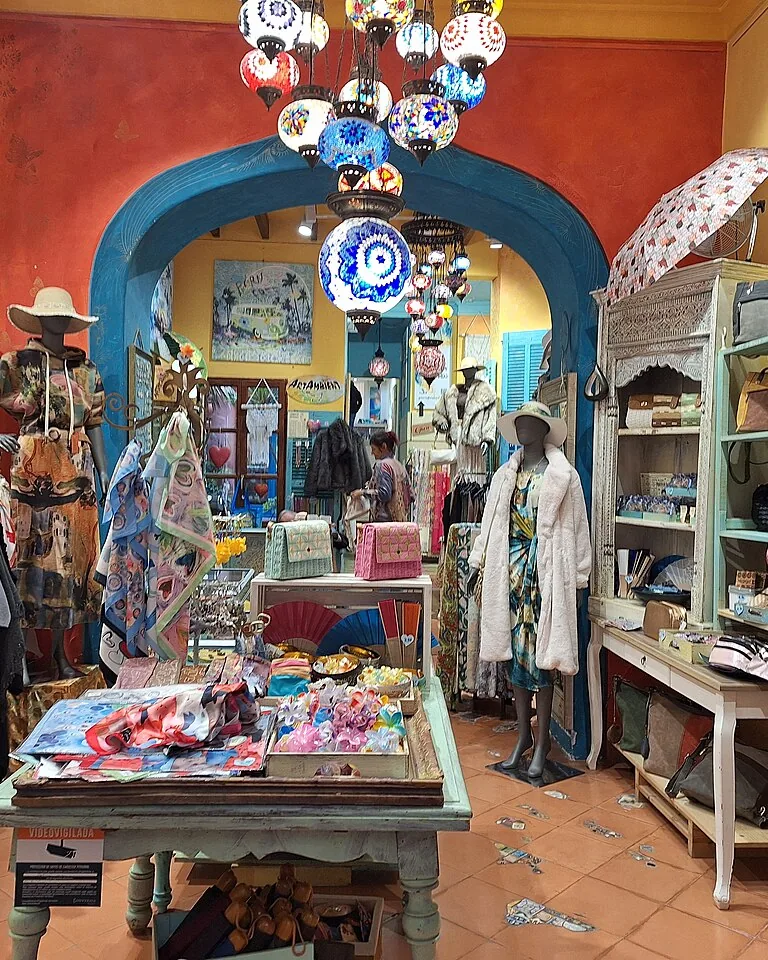
Curved or arched shelving already has architectural drama, and a muted Mediterranean print in sandy beige and faded clay warms it up without fighting the shape. Pair it with woven textures and aged wood to keep the corner relaxed rather than formal. Tip: if your walls are plaster or textured, test adhesion on a small patch first — peel-and-stick grips differently on rough surfaces.
9. Faded Stripe for a Coastal Mudroom
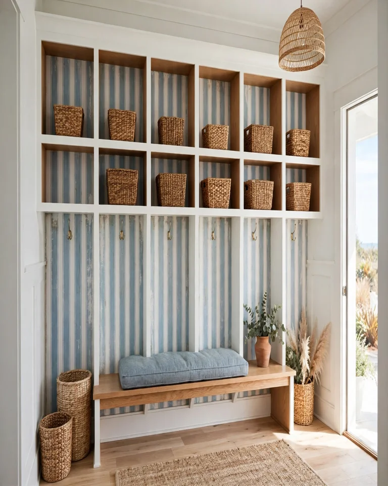
A soft, sun-faded stripe gives mudroom or entryway shelving a breezy, coastal feel and makes white oak or painted cubbies look instantly more finished. Stripes also add a subtle sense of height, which helps low, wide storage walls feel less squat. Tip: run the stripes vertically; horizontal stripes can make a wide unit feel even wider.
10. Marble-Vein Wallpaper for a Luxe Transitional Look
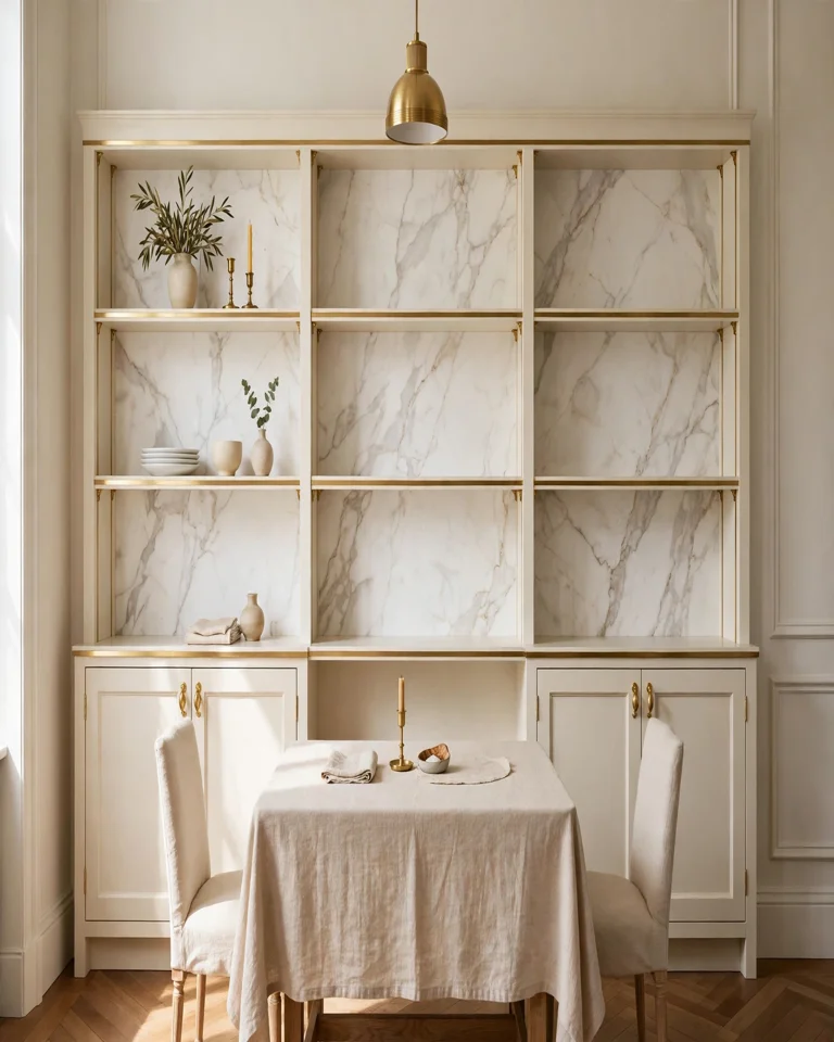
A marble-vein print behind cream or pale gray shelving reads as quietly luxurious without the cost or weight of real stone. The veining gives the eye something to follow, which works well in dining rooms and formal living spaces. Tip: pair it with metallic accents — brass or aged gold — rather than more stone, or the look tips from elegant to cold.
11. Jewel-Toned Floral for a Maximalist Dining Wall
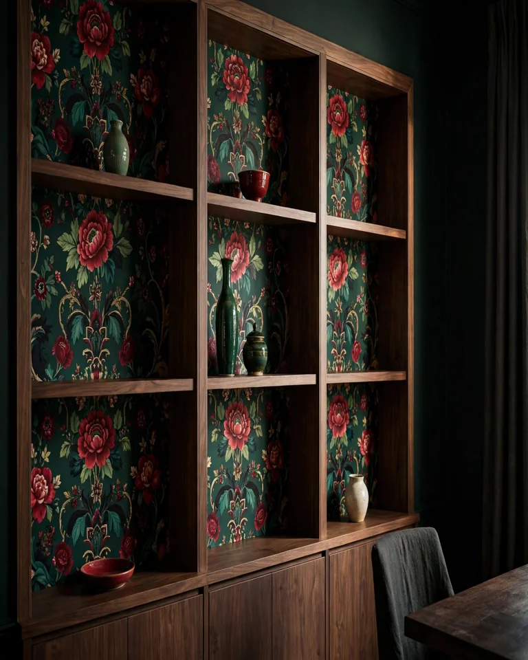
If your dining room already leans maximalist, a jewel-toned floral — emerald, ruby, sapphire on a deep ground — lets the shelving wall hold its own against bold table settings and art. The trick is commitment: one strong wall, with the rest of the room’s colors pulled from the print. Tip: style the shelves sparsely here; a bold backing plus crowded shelves equals visual noise.
12. Linen Texture for a Calm Neutral Living Room
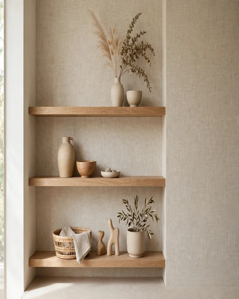
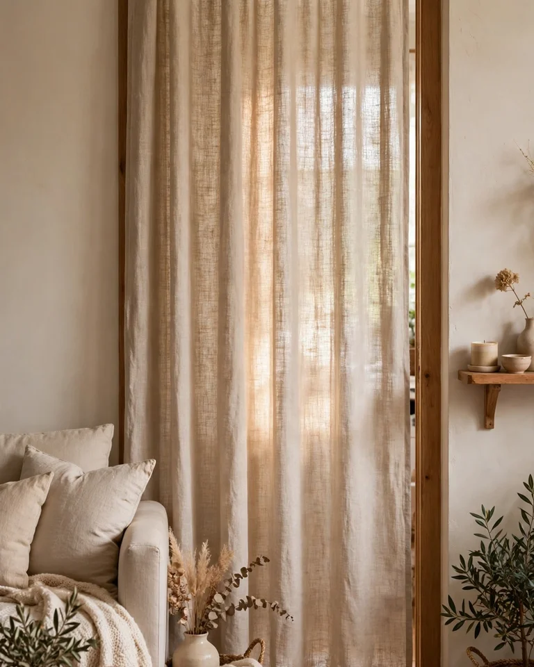
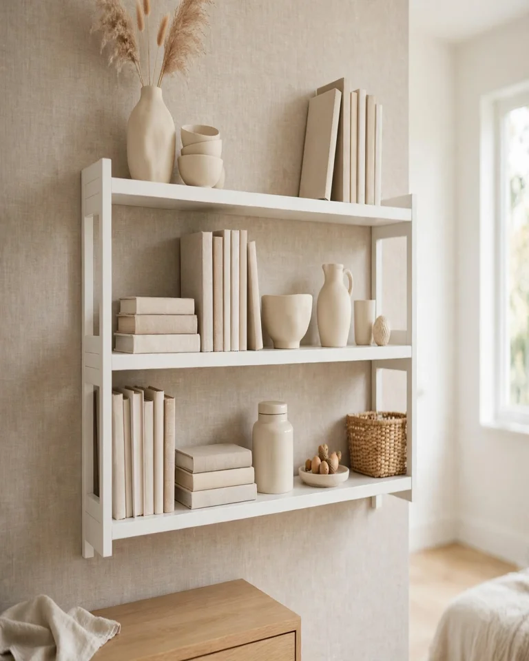
Not every shelf needs a print. A linen-textured wallpaper in warm white, oatmeal, or pale greige adds depth and a soft, tactile quality that suits minimalist and Japandi-style rooms. It also forgives seams better than a crisp geometric, since the texture disguises joins. Tip: this is the safest choice for open shelving that holds colorful objects, since it never competes with what’s displayed.
13. Graphic Black-and-Cream for a Media Wall
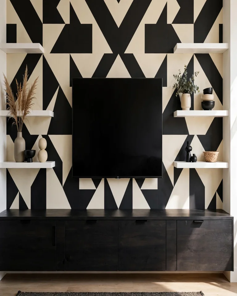
A high-contrast graphic print turns a media wall from “TV plus shelves” into a designed feature, and the bold backing means the television itself blends in rather than dominating. Keep the console below dark and low so the wall has a visual anchor. If you are planning the layout, these ideas for arranging living room furniture around a TV and fireplace help the whole wall sit right in the room. Tip: hide cables before papering — a graphic backdrop makes stray wires far more obvious.
14. Faded Bird Print for a Vintage-Inspired Built-In
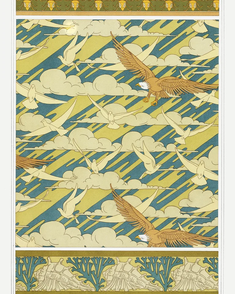
A faded bird-and-branch print in soft, washed-out tones gives painted built-ins a gentle vintage character that suits cottages, farmhouses, and collected interiors. Because the colors are muted, it works behind both books and decorative pieces without overwhelming either. Tip: mix in a few genuinely old objects — a thrifted frame, a worn ceramic — and the wallpaper stops looking like a reproduction and starts looking like part of the house’s history.
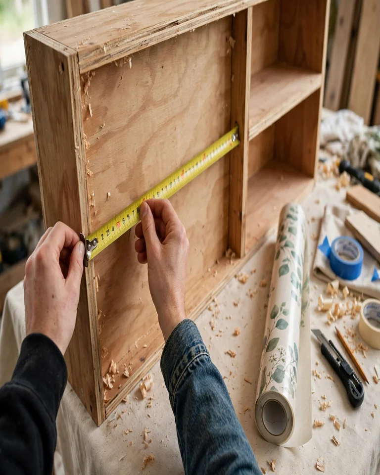
How to Measure and Install It
Measure every shelf opening separately — built-ins are rarely perfectly square, and assuming one measurement fits all is how you end up short. Clean and dry each back panel, cut the paper slightly oversized, and apply from one edge while smoothing bubbles as you go, then trim flush with a sharp knife. For a wide unit, remember the paper’s roll width: a textured print hides the seam between strips far better than a bold geometric, so choose texture if your openings are wider than your roll. If your shelves sit near a window, coordinating the backing with your window treatment ideas keeps the whole wall from feeling patched together.
Mistakes to Avoid
The most common error is pairing a loud print with fully packed shelves — the result is clutter, not character. Another is papering only the center section of a unit and leaving the sides bare, which looks unfinished. And don’t skip the test patch: stick a sample on an inconspicuous spot for a day or two, especially on painted or glossy surfaces, so you know it will both hold and come off cleanly. For greenery lovers, a botanical backing pairs naturally with the ideas in greenery bedroom ideas if you are carrying the look into a bedroom.
Where Wallpaper Works Best — and Where It Doesn’t
Wallpaper shines behind display shelving, in reading nooks, and on media walls where the shelves are styled rather than stuffed. It is less successful behind floor-to-ceiling book rows that are already fully packed, since almost none of the pattern will show. In kitchens and bathrooms, choose a product rated for humidity and wipeable surfaces, and keep it away from direct splashes. Architectural details nearby matter too — a wallpapered built-in next to a paneled wall looks intentional, as these staircase paneling ideas show for trim-heavy spaces, while a bare, untrimmed box can look like a sticker on furniture.
Frequently Asked Questions
Can you put wallpaper on the back of shelves?
Yes. Wallpaper adheres well to most shelf backing surfaces — painted wood, MDF, and laminate — as long as the surface is clean, dry, and smooth. Peel-and-stick varieties are the easiest choice for a first project because they reposition and remove cleanly.
Is peel-and-stick wallpaper good for shelves?
Yes, for most shelf projects it is the best option. It needs no paste, no special tools beyond a knife and smoother, and it suits renters or anyone who likes to change decor seasonally. Just check the manufacturer’s guidance for your surface and test a small piece first.
Does busy wallpaper work behind bookshelves?
Usually not. Books already create a dense, colorful pattern of their own, so a loud print behind them tends to look chaotic. Tonal textures, small-scale prints, and low-contrast patterns are calmer choices behind full book rows; save bold prints for display shelves with breathing room.
How much wallpaper do I need for a bookshelf?
Measure the height and width of every backing section, add them up, and buy a little extra — especially if the design has a pattern repeat that must be matched across strips. One standard roll usually covers a small bookcase, but a full built-in wall may need two or three.
Can renters use wallpaper on shelves?
Yes, removable peel-and-stick wallpaper is designed for exactly this. It comes off without damaging most surfaces, but always test removal on a hidden spot first and follow the manufacturer’s instructions, since adhesion varies by paint and finish.
Final Thoughts
A wallpapered shelf back is one of the highest-impact, lowest-cost upgrades in home decor: it adds depth, color, and a custom-built feel without replacing a single piece of furniture. Start with one unit, pick a pattern that respects your shelf color and your room’s light, and style the shelves with a light hand so the backing can do its job. If you love the effect, you can carry it into a reading nook, a media wall, or even a powder room — and for a softer, light-filtering companion to the look, these stained glass window ideas add color without another patterned wall.