12 Two-Tone Living Room Color Ideas That Don’t Look Random
Two-tone living room color ideas work when one color leads and the second supports it. That is the whole secret: give the dominant shade about two-thirds of the visual weight, let the second color show up in more than one place, and keep the rest of the room calm enough for both to breathe. When that balance is right, even a bold pairing looks intentional instead of random.
Below are 12 two-tone living room color ideas that follow that rule, from classic navy and white to earthy terracotta and beige. Each one tells you where to put each color, what it pairs well with, and the mistake that makes it fall apart — so you can pick a combination with confidence, not just a pretty paint chip.
1. Navy and Warm White With a Chair Rail Split
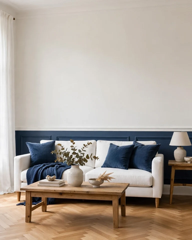
Paint the lower wall navy and the upper wall warm white, with a chair rail marking the split. The dark base grounds the room while the lighter top keeps the ceiling feeling high, which makes this one of the safest bold pairings for a first two-tone attempt. It suits traditional and transitional rooms especially well.
Tip: Keep the white slightly warm, not icy blue-white, so the navy reads rich rather than cold. Repeat the navy once more in the room — a throw, a pair of curtains, or an ottoman — so the wall color does not feel stranded.
2. Sage Green and Cream for a Soft, Nature-Led Room
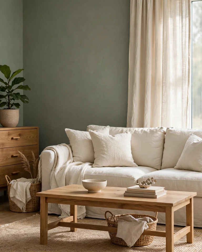
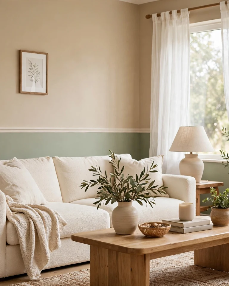
Sage green walls with cream seating and curtains create a calm room that still has personality. Because both shades are muted, the contrast stays gentle, and natural wood tones bridge the two beautifully. This pairing works in rooms that get moderate light and in homes that lean farmhouse, cottage, or organic modern.
Tip: Add texture instead of a third color — linen, woven baskets, and a nubby rug keep the palette from feeling flat.
3. Charcoal and Soft White Horizontal Split
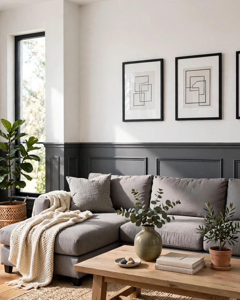
A charcoal lower wall with a soft white upper wall gives the room structure without a full dark repaint. The darker band anchors heavy furniture like a sectional, while the white above keeps the space from closing in. It is a strong choice for rooms with average ceiling height.
Tip: Use a satin or eggshell finish on the lower half, which handles scuffs better, and matte paint up top to hide small wall imperfections.
4. Terracotta and Warm Beige With a Color-Blocked Arch
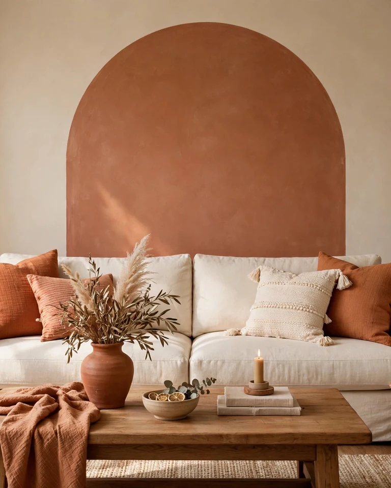
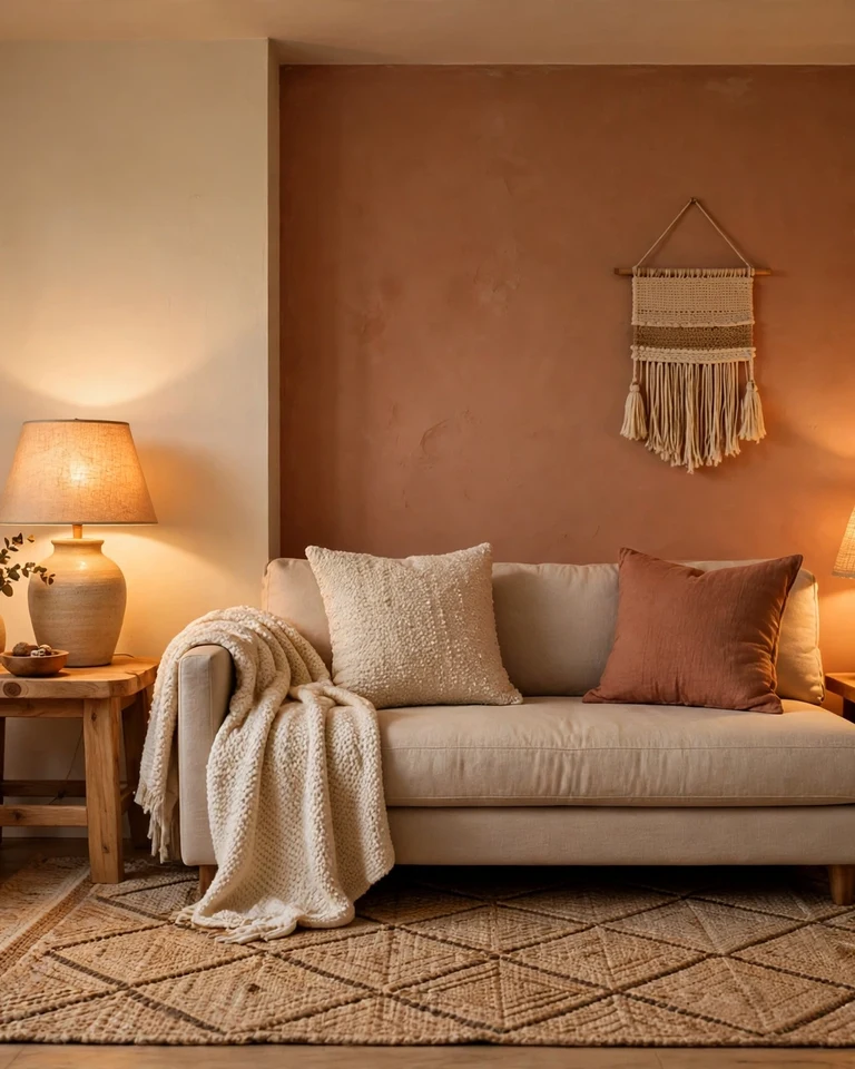
Instead of splitting a whole wall, paint a terracotta arch or large color block behind the sofa on a warm beige wall. The shape becomes the artwork, and the earthy pairing adds warmth without repainting the entire room. This is a renter-friendly way to test a bold color.
Tip: Echo the terracotta in one or two small pieces — a vase, a cushion, a throw — so the arch feels connected to the rest of the room.
5. Dusty Blue and Crisp White for a Coastal Feel
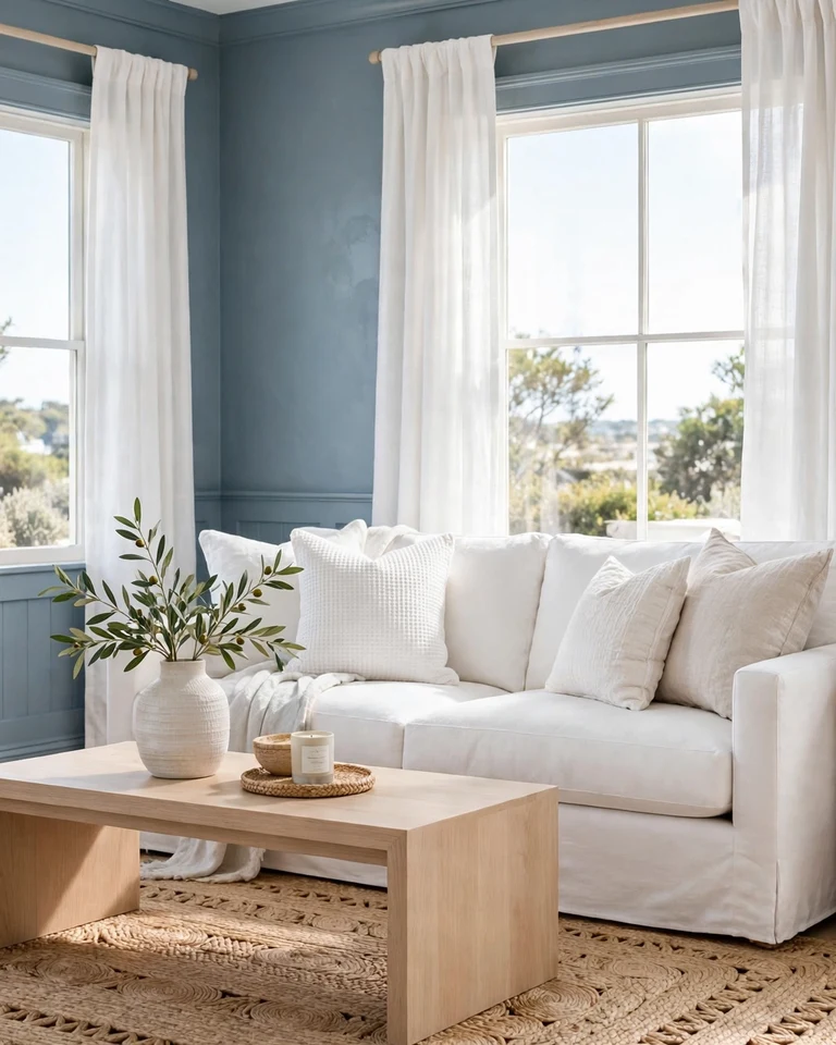
Dusty blue walls with crisp white trim, curtains, and seating feel fresh without turning beachy or themed. The blue brings calm, the white keeps it bright, and pale wood finishes warm the whole thing up. It works especially well in rooms with good natural light.
Tip: Avoid pairing this with a second strong blue; let the dusty blue be the only blue in the room and use sand, linen, and light wood as its support crew.
6. Olive Green and Warm Cream With Dark Wood
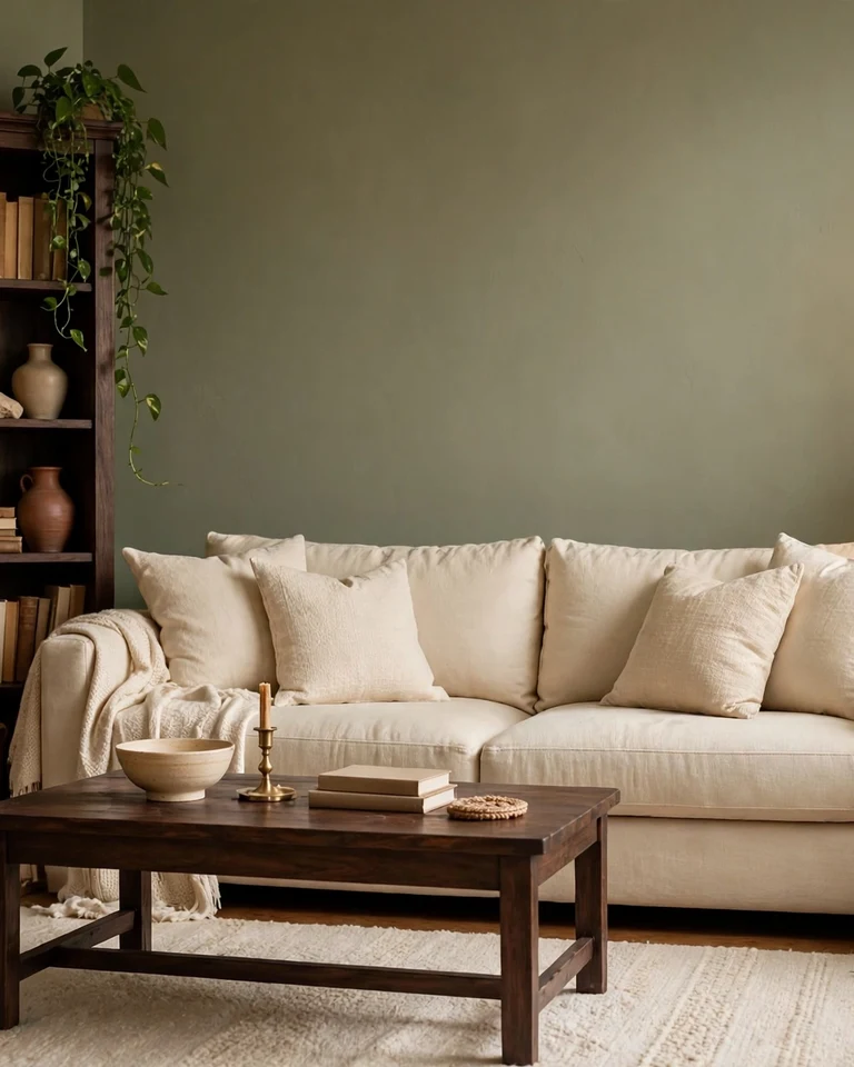
Olive walls with warm cream upholstery feel grounded and collected, especially when dark wood furniture ties the two together. Keep the olive on the main walls or built-ins and let cream carry the seating and rug so the center of the room stays light.
Tip: A few trailing plants reinforce the earthy mood, but stop before the room starts looking like a garden center — the olive wall already did that job.
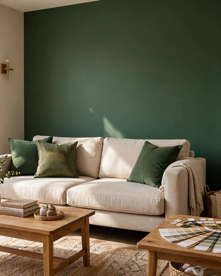
7. Deep Teal and Ivory for Quiet Drama
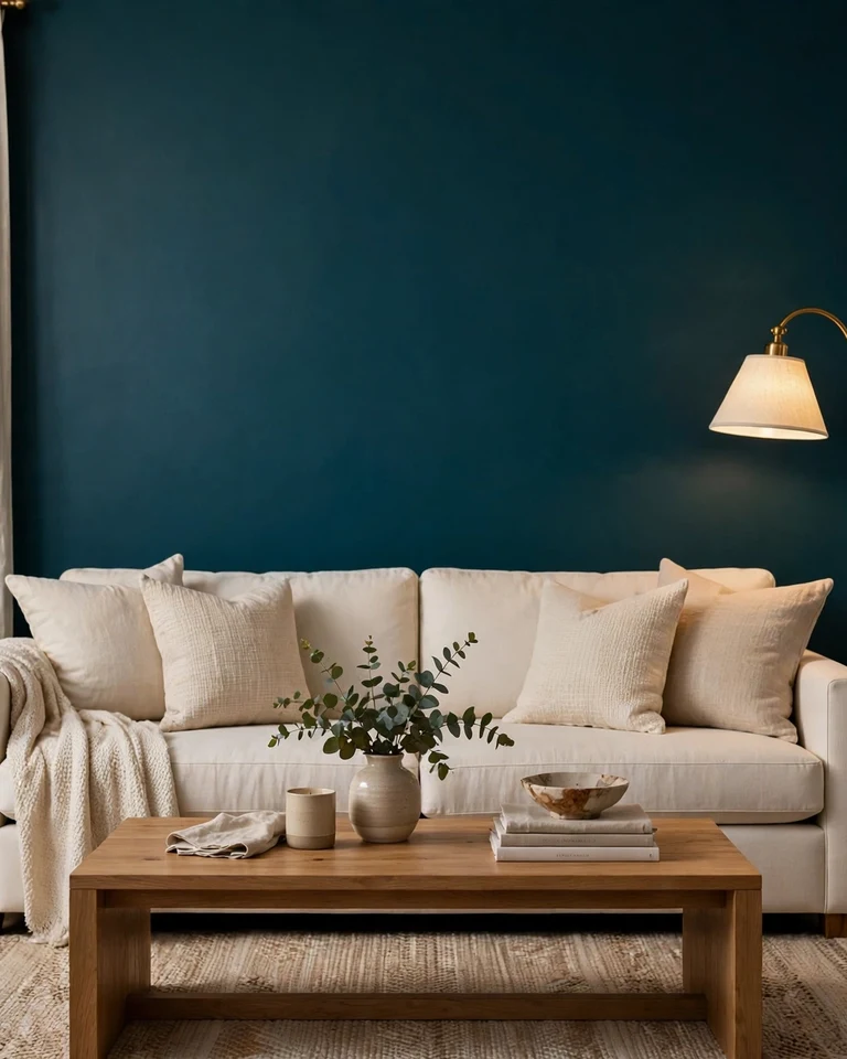
Deep teal on one feature wall or the lower half of the walls, with ivory everywhere else, delivers drama without darkness. Teal sits between blue and green, so it pairs with both warm brass and cool silver accents, which makes finishing the room easier.
Tip: In a dim room, limit the teal to a single wall or the wall behind the sofa so the color adds depth instead of gloom. For more on that balance, see our guide on how to brighten a dark room.
8. Warm Taupe Walls With a Painted Ceiling as the Second Color
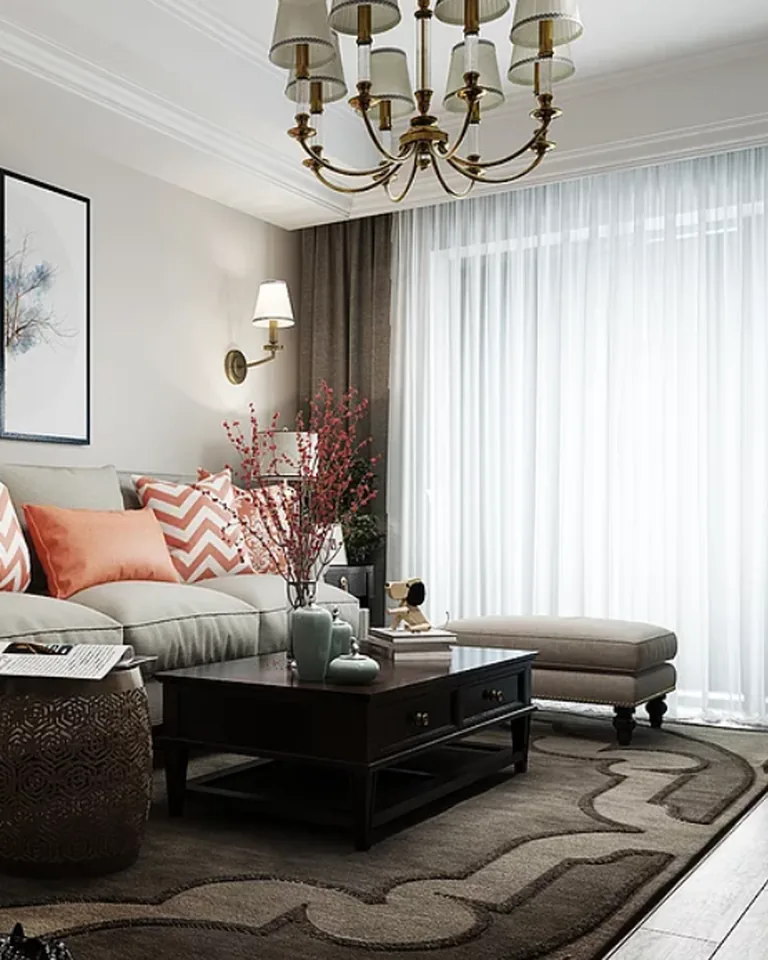
Most two-tone rooms split the walls, but the ceiling — the so-called fifth wall — can carry the second color instead. Warm taupe walls with a ceiling painted a shade or two deeper, or in a soft contrasting tone, make a high-ceilinged room feel more intimate. It is an unexpected move that still reads classic.
Tip: Only try a darker ceiling if the room has decent height and light; in a low, dark room, keep the ceiling the lightest surface in the space.
9. Mustard Yellow and Soft Gray for a Cheerful Lift
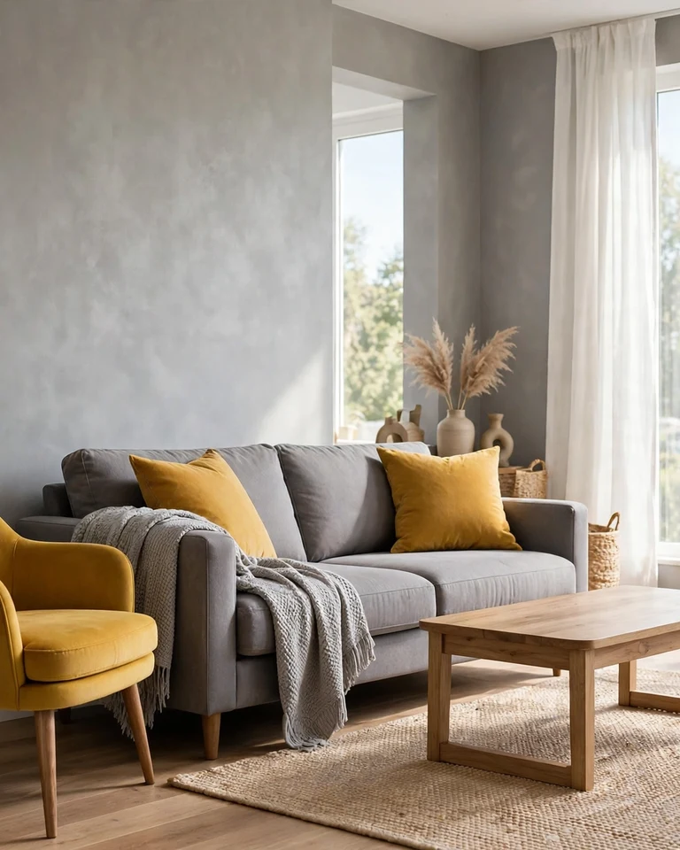
Soft gray walls with mustard in the seating, curtains, or a single accent chair add sunshine without shouting. Gray keeps the room grounded while mustard does the personality work, and because mustard appears in smaller doses, it is easy to swap out later if tastes change.
Tip: Keep the mustard to seating and textiles, not the walls — a full mustard wall is much harder to live with than a mustard chair.
10. Chocolate Brown and Warm Cream for a Layered Neutral Room
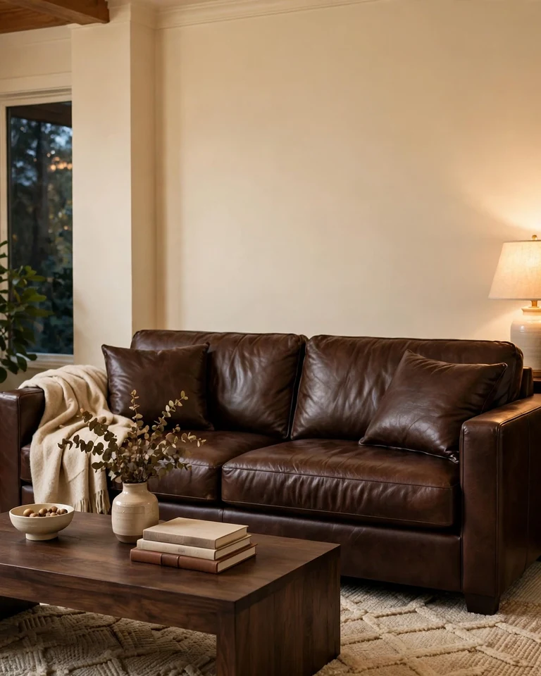
Chocolate brown furniture and wood tones against warm cream walls create a two-tone room without a drop of wall paint in a second color. The contrast comes from furniture, flooring, and textiles, which makes this the lowest-commitment idea on the list and one of the warmest.
Tip: Add a cream or oatmeal rug between the dark furniture and the floor so the brown pieces do not visually sink into dark flooring.
11. Butter Yellow and Soft Gray for a Light, Happy Room
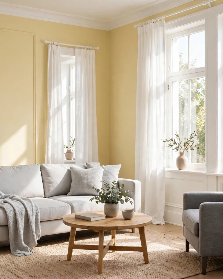
Butter yellow walls with soft gray seating feel sunny but grown-up — the gray keeps the yellow from tipping into nursery territory. This pairing suits small and north-facing rooms because both colors reflect light well, and white trim sharpens the edges.
Tip: Use the yellow on walls and keep the gray in the larger furniture pieces; reversing that ratio makes the room feel heavier than it needs to.
12. Painted Built-Ins as the Second Color
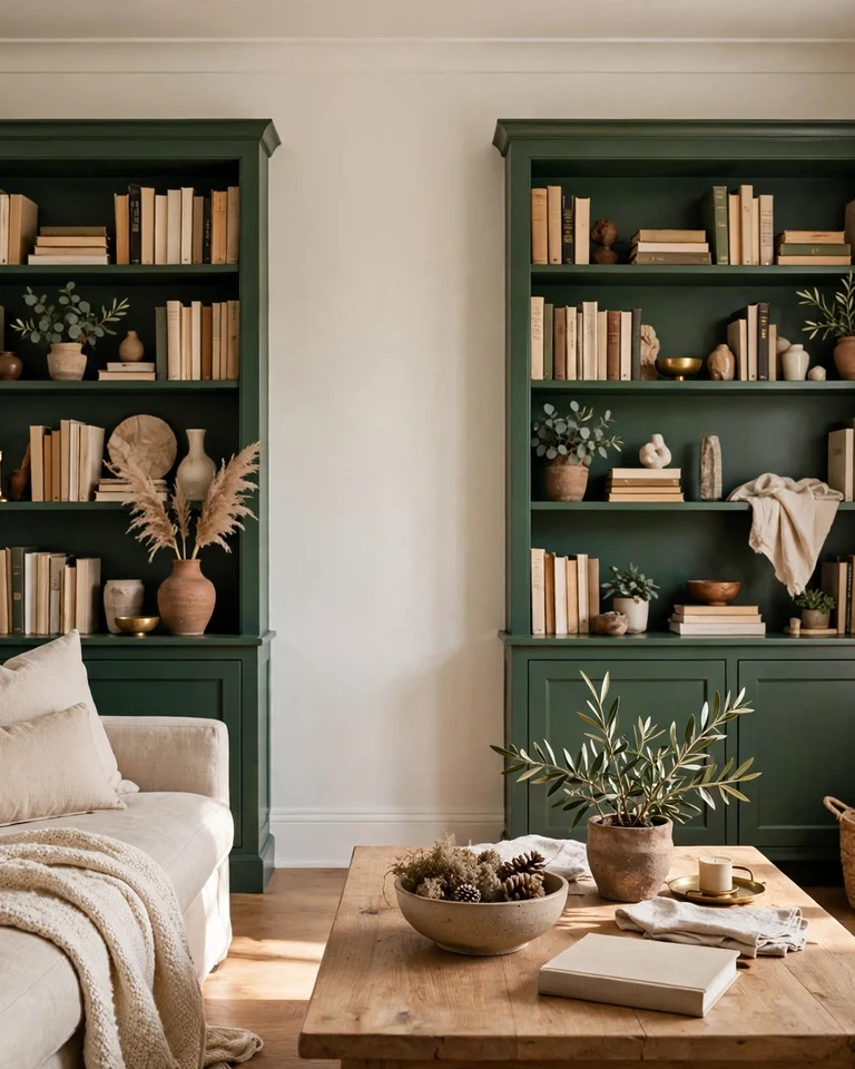
Instead of splitting a wall, paint the built-ins, bookshelves, or media unit in a contrasting color and keep the walls neutral. A deep green, navy, or charcoal bookcase against warm white walls creates a two-tone effect with architectural intention — the color has a clear job, framing books and display pieces. It also defines the room’s layout: when arranging seating around a feature like this, the same principles in our guide to arranging living room furniture around a TV and fireplace apply.
Tip: Style the shelves in the wall color and the built-in color only, plus wood and plants, so the shelves read as a designed display rather than clutter. A fireplace wall works the same way — see shiplap fireplace ideas for a cozy living room for how a feature wall anchors a palette.
How to Pick Your Two Colors Without Guessing
Start with the room, not the paint chip. Note how much natural light it gets, what color the flooring and largest furniture pieces are, and whether the room runs warm or cool. Then use the 60-30-10 rule: roughly 60 percent dominant color, 30 percent secondary, and 10 percent accent. Test large swatches on the wall and check them in morning and evening light before committing — paint looks different at home than in the store.
One more rule that saves most two-tone rooms: repeat the second color at least twice. A color that appears only once looks like an accident; a color that appears in the walls and again in the curtains or cushions looks like a plan. Finish the look with window treatments that support the palette, as in our window treatment ideas, and the whole room will feel pulled together.
Frequently Asked Questions
What is the 60-30-10 rule for living room colors?
It is a simple proportion guide: about 60 percent dominant color (usually walls or large furniture), 30 percent secondary color (upholstery, curtains, or rugs), and 10 percent accent color (pillows, art, and small decor). It is a starting point, not a strict formula, and it keeps a two-color room from feeling random.
Should the darker color go on the top or bottom of the wall?
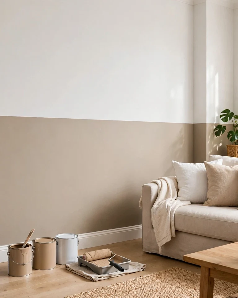
Usually the darker color goes on the bottom and the lighter color on top. That grounds the room while keeping the ceiling feeling high, and it works especially well in rooms without tall ceilings. A chair rail or molding at the split makes the line look crisp and finished.
What two colors go best together in a living room?
Dependable pairings include navy and warm white, sage and cream, charcoal and soft white, and terracotta and warm beige. The best choice depends on your light, flooring, and furniture — a pairing that looks great in a bright room can feel heavy in a dim one, so always test swatches at home first.
Can a two-tone wall make a small living room look bigger?
Yes, if the lighter color does most of the work. Keep the darker shade to the lower wall, a single feature wall, or built-ins, and let the lighter color cover the larger surfaces. That adds structure and depth without closing the room in.
Do I need a chair rail for a two-tone wall?
No, but it helps. A chair rail, picture rail, or simple molding gives the color change a clean edge and makes the split look deliberate. Without trim, careful taping and a steady hand can still give a sharp line — just pull the tape off while the paint is still slightly wet.